Japanese Computers – Still Living It 8-bit
Recently, there has been a kind of fad in the west where people get all nostalgic about the days of 8-bit computers. The epitome of the 8-bit computing days was the low-res graphics, with characters typically rendered using the bare minimum number of pixels. Of course, technology has advanced since the days of the Commodore 64, and since the advent of sub-pixel rendering (called ClearType in Windows), in particular, the blockiness of text rendered on a computer screen has become barely perceptible for the Latin (i.e. English) alphabet. However, the Latin alphabet is not the only script in the world, and a more interesting question from the perspective of internationalization and globalization is how more complex scripts are rendered in modern times.
To explore this, Japan provides the perfect confluence of the most complex written script in the world, in the form of Chinese characters (Kanji), combined with one of the most technologically advanced societies in the world. The sad truth, however, is that Japanese and Chinese text on modern computers is in many ways an order of magnitude worse than English on the 8-bit computers of the 1970s. To start with, let’s look at some of the more complex characters in current use in Japanese. The first five are common characters taught in high school, the last two I picked randomly from the Japanese encoding standards for their complexity. (Rendered at 72-pixel x 72-pixel resolution).

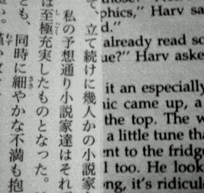
Now, let’s jump right in and see how the same characters look in Windows Explorer when used as part of a filename (Japanese Windows XP under default settings, blown up 6x for comparison).

Clearly, the 12×12 pixel character cell size of the default font is nowhere near sufficient. It makes the fonts on 1970’s 8-bit computers look positively futuristic. If you’re wondering about other operating systems, just remember that Mac and Unix monitors have the same dot pitches as PC monitors. Before we can really understand what this means, let’s take a look at the how Japanese handle their own script when freed of the limitations imposed by western-based design decisions.
Native Choice
First, we need to establish a foundation for comparing Japanese and Latin characters. The following shows a side-by-side comparison of the on-paper printed text in the novels Onmorakinokizu (陰摩羅鬼の瑕) by Kyogoku Natsuhiko and The Diamond Age by Neal Stephenson. These are both long, well-written, intricately plotted novels aimed at adult audiences. (As an extra data point, I have a couple of Chinese novels that use pretty much the same font sizes as Japanese novels).
It is interesting to note that the font sizes are almost identical vertically, and roughly 2:1 horizontally. That is, most of the extra detail needed for Japanese characters is realized by creating finer detail within the characters, not by extending the characters outwards. An interesting example of how this affected technological development comes from the dot matrix printers that were popular in the late 70s and throughout the 80s.
9-Pin Versus 24-Pin
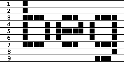
Anyone who owned a computer during the 1980s would know that there were basically 2 types of printers: 9-pin dot matrix and 24-pin dot matrix. In the west, 9-pin dot matrix printers were sold as the basic model while 24-pin printers were sold as offering more readable near-letter quality (NLQ) printing. It’s easy to see the reason for 9 pins; it’s the minimum that can produce readable English text:
What you might not know is that 24-pin dot matrix printers were not developed to print clearer English text, but were developed in Japan to print Kanji. The 72-dpi resolution of a 9-pin printer simply cannot print readable Japanese text. As the following blow-up of 24-pixel text shows, this resolution is just high enough to render these complex characters – making it the Japanese equivalent of the 8-bit days. (Because I’ve used a Windows font to capture the image, the characters are not as well defined as they would be from a Japanese printer or mobile phone of the same resolution).
Compared to 72-pixel font:
Japanese Standards from the 1980s
A second data point for what the Japanese considered to be the minimum resolution comes from the Japanese industrial standards from the 1980s. These define character bitmaps for 16×16 and 24×24 dot resolutions. These bitmap fonts needed to be defined as a standard so that complex kanji could be simplified in a standard way on lower resolution devices. While the 16-dot font is clearly incapable of handling the complex characters above, it is perfectly usable for more common characters, making it suitable for applications that do not necessarily need to recreate every character. Interestingly, Japanese computers from the 1980s used 24×24 dot fonts that put modern operating systems to shame.
A More Modern Example: Mobile Phones
One area of technology where the Japanese are still on the cutting edge is in mobile phones (English specs of one of this year’s models). While most foreign manufacturers have caught up with the 32-bit processors Japan introduced in the 1990s to handle Kanji text input, the west is still lagging behind in terms of screen resolution. As an example, it is actually difficult to find phones in Japan that have screen resolutions under 300dpi. My current phone (the Sharp 910SH), which was released in 2006, has a 2.4-inch full VGA (640×480) screen at 330dpi. For comparison, this year’s Apple iPhone (3.5-inch screen), Google Android (3.2-inch screen), and most other western smart phones offer the lower half-VGA (480×320) resolution, putting them in the 160-180 dpi range. When contrasted with 96dpi computer monitors, the difference is even more dramatic. Just to make the point, here is the default email list font size of the mobile phone (40×40 pixels) compared to the default in Thunderbird (12×12 pixels), which is also the same as Outlook.
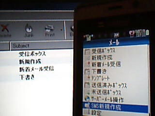
*Disclaimer: The screen shot is actually of the menu, which uses the same font size, because I didn’t want to show my person emails.
As a professional translator who has spent 8+ hours everyday reading Japanese text on a computer monitor for many years, I can tell you that reading text on a Japanese phone is a pleasure by comparison. The fiddliness of a small screen that can only display a small amount of text at a time is more than outweighed by the clarity of the text. It’s like stepping from the stone age into the 21st century.
Computer Monitors
As I mentioned earlier, the majority of computer monitors have DPIs at around the 100 mark. So why haven’t the Japanese created high DPI monitors to make Japanese easier to read on computer screens? One explanation could be the tradeoff between the expense of a higher DPI monitor versus the benefit obtained from the clearer text. However, this cost factor was never a stumbling block for 24-pin printers, nor for Japanese computers offering VGA resolutions as standard five years earlier than in the west, nor for the high resolution mobile phone screens used today, nor for the myriad of other products in Japan that are more expensive because they are made to handle Japanese text more cleanly. In fact, NEC did begin producing a 15” laptop with a resolution of 2048×1536 (i.e. 170 dpi) in 2002, which at $4500 was more than double the $2040 price tag of an equivalent model with a regular 1024×768 screen. This price dropped to $3500 in 2005, with the models subsequently replaced by widescreen models at the much lower 135dpi mark (the current model has a 16” screen with a 1920×1080 resolution starting at $1350).
Although this large price difference is certainly a factor, I don’t think it is the main reason. Because LCD monitor prices are tightly linked to production volumes, the prices of high DPI monitors would come down if there were enough demand (again, this is exactly the same situation as 24-pin printers, etc.). However, if a problem aside from price were to act as a deterrent to buying higher resolutions panels, then the panels would never become popular and the prices would never drop. And the main deterrent in this case comes from the operating system and the programs running under it.
If we simply replace a 1024×768 monitor with a 2048×1536 monitor of the same size, everything on the screen is suddenly twice as small, not twice as highly detailed. Instead of gaining a more readable display, high DPI monitors actually deliver harder-to-read displays. Theoretically, in Windows at least, you should be able to change the DPI setting of your graphics card in Control Panel from the 96dpi standard to 192dpi to get the same physical size display but with much more clearly rendered fonts. Unfortunately, this does not work properly in Windows. Even worse, the problem is not in Windows itself (in which case it would be easily fixable), but in poorly written third party drivers and other programs. The problem arises when the outer containing window size does not scale with the DPI setting, while the content of the window does, making it impossible to access the all-important OK and Cancel buttons in the bottom right of the Window.
This is not just a problem for the Japanese. My dear old parents have worsening eyesight, and in an attempt to increase the size of the text on their 19″ LCD monitor, they changed the resolution setting from the native 1280×1024 down to 1024×768 (and yes, it was extremely ugly, but it achieved the desired effect of making the text on the screen bigger). Of course, I couldn’t stand the ugliness of the resolution mismatch and went and changed the DPI setting to large fonts (120 dpi) and returned the monitor to its native resolution. But sure enough, the next time they tried printing, the print settings screen (provided by the printer driver) appeared with half the content expanded outside of the window, with no scroll bars and no resizable border.
I suspect that this is a common experience among people who have tried changing their DPI setting, and is undoubtedly one of the reasons why the DPI setting is buried so deeply within the computer settings. The reason this problem is so common is that Windows uses a mixture of units for creating windows and controls. Windows must be created by specifying the size in pixels, which do not scale. The programmer therefore has to perform a manual calculation by fetching the system DPI setting in order to determine the scaled window size in pixels. The controls within a window, however, are typically specified in twips or other inch-based units, and therefore automatically scale. (Even if the tool the programmer uses shows dimensions in pixels, these are often converted into twips internally to get the automatic scaling effect.)
In any event, the net result is that creating high DPI monitors for computers that can deliver high quality Japanese text is not really a technical problem that the Japanese can solve. Even at the operating system level, it is difficult to see how the problem can be solved when third-party application developers still tend to think of control/window sizes and positions in terms of fixed pixels instead of scalable units. So the Japanese are stuck with jagged text reminiscent of 8-bit computers, at least for the time being.
With the rise of China, which also requires high DPI for the Chinese language, it will be interesting to see if the western operating system makers can come up with a solution before someone in China embarks on creating a new operating system to deal with the problem. I guess that one solution would be to treat high DPI monitors as having a logical resolution a sub-multiple of the native resolution, and then offering access to the physical pixels only to the OS font-rendering routines and to applications that declare themselves aware of this ploy. That is, a 2048×1536 screen would appear to applications as having a resolution of 1024×768, with the font rendering treating the 2×2 pixel blocks that make up each logical pixel as sub-pixels in a similar way to current sub-pixel rendering technology. Unfortunately, it is difficult to imagine a hardware manufacturer producing such a high resolution display again given that Microsoft made no moves to implement such technology during the 6 years while NEC was manufacturing high DPI laptops (or perhaps this another casualty of the Vista train wreck). However, I still hold out hope that the computer monitors in the future will again become easier to read than my tiny little 2.4-inch mobile phone screen.
Tweet
Aaron said,
November 3, 2009 @ 10:23 am
Great post! Are you sure 甕 is learned in high school though? It’s not 常用漢字, but does have a 常用 equivalent: 瓶.
Mac OS X has had resolution-independence on its radar for several releases now. Since they control the whole widget, I’d look to Apple to deliver a high-resolution solution before Microsoft. Their market share isn’t huge, but even in Japan it may be enough to push other manufacturers (as they did in making USB ubiquitous and getting touch controls on phones).
Gatunka said,
November 3, 2009 @ 12:44 pm
You’re right. I’m not sure how I made this mistake, since I originally picked the first five out of The Kodansha Kanji Learner’s Dictionary to make sure that they were 常用漢字. I’ve certainly seen the complex form 甕 used in novels before, though, so it does have some relevance.
Anyway, thanks for your comment and for reading!
Troy said,
November 4, 2009 @ 5:57 pm
heh, 鬱 is a personal favorite of mine since it is the most complex kanji my dictionary lookup tool that I’m working on can handle at the moment (and the most complex kanji I’ve come across in my studies/reading).
At any rate, Windows 7 does in fact still have cruddy fonts while OS X 10.6 looks kinda decent:
http://img59.imageshack.us/img59/4135/screenshot20091104at124.png
Reviewers with the new higher-density Android do say the higher dot pitch does make a big difference compared to 160DPI.
One issue with higher-density displays is defect rate. I don’t have any inside information, but it must be harder to create flawless high-density displays of any great size, so it’s not just a matter of economies of scale.
Jostein Kjønigsen said,
November 4, 2009 @ 11:59 pm
@Aaron. I see you mentioning how Mac OSX solves this problem without the usual smug remarks, so not going to shit on that directly. Good for Mac users, as I agree DPI independence in the UI is an important thing.
That said (and that particularly goes to the blog author): Microsoft released WPF a long ago, and WPF is all vector, not pixel based. I’m not going to say the API is flawless (it isn’t), a gift from the Gods (it isn’t) and can’t be abused by developers hellbent on making their solution inflexible (it can), but it also goes a long way of solving this particular problem and it is supported all the way back to Windows XP SP2.
For developers on the Win32 platform I see little to no reason for not using it, especially now with the tool-support shaping up, and in that remark especially the upcoming Visual Studio 2010 release. Why Microsoft didn’t add a fully featured XAML/WPF editor into Visual Studio 2008 is still something I can’t comprehend.
Aaron said,
November 8, 2009 @ 10:17 pm
@Jostein: While I am a Mac user, I’d be happy for anyone to bring proper resolution-independence to the desktop. If anything, I’m disappointed that it’s still not available in OS X despite being rumored for so long.